Making Data Moves: The Prep Work Behind Every Good Analysis
By Tim Erickson, Epistemological Engineering


I didn’t expect to learn anything about data science from repainting my porch steps—but that’s exactly what happened.
It had been 15 years since my front steps were last painted. They were dirty, you could see bare wood on the treads. After borrowing a friend’s power washer —a sure way to discover just how filthy something has gotten—it was clear I needed to repaint them. I am no home-maintenance expert, so I asked Jan at the local hardware store how I should prepare. Power washing was a good start, she said. But let it dry, spackle the holes and big cracks, then use 80-grit sandpaper everywhere to make a good surface. Next, clean off the dust and blue-tape all the edges. Then, put on a coat of primer and two coats of deck-quality paint.
It sounded simple, but if you’ve done this, you know: sanding, cleaning and taping easily takes three times as long as painting.
This process is surprisingly analogous to data science. If you ask a data scientist, they will tell you that a huge proportion of their work is preparing the data: figuring out what the raw values actually mean, cleaning the data, organizing it, and getting it into shape for analysis.
As educators, we often feel tempted to do all the prep work ourselves and just hand students the roller, ready to paint. There are times when that’s a good idea. But with modern tools for teaching data science, we can empower students to do a judiciously-chosen part of the prep work themselves. And in contrast to painting, this data-munging process—making data moves—is fun and rewarding in itself, in a way that sanding and taping never is. I hope by the end of this post, you’ll agree that learning data moves can actually help students become more critical consumers and producers of data. I hope you also see that data moves are for more than just prep work. Data moves can give you insight into the data and become an essential part of your data-analysis toolbox.
Let’s see an extended example. Suppose we want to explore gender differences in income. We might begin with the assumption that males earn more, but we want to verify that and even determine how much more males earn. So, we get a bunch of U.S. Census data using the CODAP Microdata Portal (I will use CODAP here, but you can easily do this sort of thing using any modern data-analysis platform). We begin (foolishly, as we will see) by grouping the data by sex (the Census uses “sex” rather than “gender”) and computing the mean of total personal income.
Here is what we see on the screen:
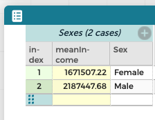
That is, males earn an average of about $2.2 million, while females earn $1.7 million. Done. Problem solved.
Just kidding.
One foolish decision was to use mean instead of, say, median. But the real problem that we didn’t explore our data first, for example, by graphing:
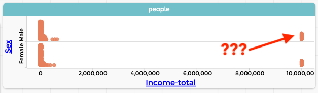
Who are all those people making 10 million a year? We click on one of those points in the graph, and a case highlights in the table. It’s a ten-year-old girl. What? We select a different point and it’s a two-year old boy. Further investigation—more selections, perhaps a graph—reveals that every case marked as having a total income of 9,999,999 is a child under 15. That is, the Census Bureau uses that number as a flag to indicate that we shouldn’t use that data. So we remove those data values—using some technique that will depend on your software—and proceed. Now we have a much more sensible result (we’re showing the median in the graph):
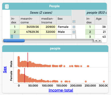
We see that the median income for males is $11,100 more than the median for females.
Interesting! If you use data straight out of the box (or directly from an AI; ask me how I know) you can get very wrong answers. To get a result that better reflects reality, you need to look critically at the dataset and alter it responsibly.
When my colleagues and I thought about what we naturally did when we analyzed data, we saw ourselves doing the same kinds of things over and over. We called these common data-analysis actions data moves. Here are three:
Filtering: We “slice” the dataset to show only a subset—here, cases that do not have 9999999 for total income. Filtering restricts the dataset to those cases that are relevant to the investigation.
Grouping: The original dataset was not separated by sex. If you imagine the dataset as a deck of cards, this is like sorting the cards into two piles. Of course, students have to learn how to do that with their software. But more importantly, they must understand the need to group the data at all, that grouping is a necessary step in the process of assessing income differences.
Summarizing: To compare the groups, we summarized them using the mean income. Again, students need to know how to create that measure, and how to apply it separately to the groups. We also need to know what measures are appropriate. Note: sometimes the best measure is one you invent yourself!
What makes something a data move? According to our paper, a data move is an action that alters a dataset’s contents, structure, or values. In our example, we altered the dataset’s contents (by filtering out irrelevant cases), structure (by grouping the data into two subsets, Female and Male), and values (by calculating means and medians).
To be sure, not noticing that all the children are making almost 10 million dollars was an egregious mistake. But data moves do much, much more than fix problems like these. A cycle of analysis and reflection often uncovers other issues or opportunities we might want to address.
For example, in that last graph, did you notice that there is a big pile of points near zero income? And that the pile is taller for females than males? Is that because many women do not get paid for their work?
This gives us additional ideas for analysis. For example, we could calculate what percentage of men and women of working age have, in fact, no income. Those numbers might be good to know in an investigation about income inequality. That would require an additional “summarizing” data move, to calculate that percentage for each group.
It also makes us wonder, is the difference in medians we see between men and women simply because fewer women are working? That is, are women who work paid as much as men who work? We can investigate that by filtering again, leaving only people currently working. Fortunately, our dataset includes a column called Employment_status that we can use to set up that filter:
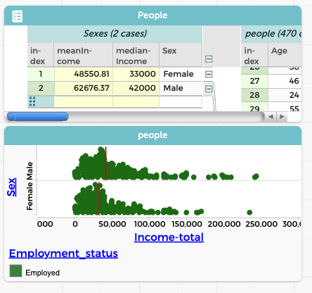
Interesting! Now we have no piles at zero, and the difference in median incomes has narrowed from $11,100 to $9,000—but it did not go away. That is, a difference in employment status cannot completely explain the gender gap we see in median income. Something else is going on.
Let’s reflect: I think, for lack of a better term, that an investigation like this, and the way we’re working with the data, “smells like” data science. How is this any different from the data manipulation we teach, for example, in elementary or middle school, or in a formal statistics class in high school or college? There, students learn the (very important) difference between mean and median, or how to find the interquartile range, or how to fit a least-squares line, or how to perform some statistical test. When we teach those skills, we often give our students pre-digested datasets that are set up to highlight the particular procedure that’s the focus of the lesson.
For me, those skills, while vital, do not smell like data science. A task that passes the data science sniff test often has larger, more wide-ranging datasets, datasets where it’s not obvious what you’re supposed to do at first. We often say that in a data science task, you might feel “awash” in data. Even when we know what we’re trying to accomplish—to study gender differences in income—we discover that the situation is more complicated than we thought, that we need more nuance.
And how do we get more nuance out of an ocean of confusing data? Often, that involves data moves. Consider this: a filtering move, by its very nature, reduces the size of the dataset, which can reduce that “awash” feeling. Even more importantly, looking at a carefully-chosen subset of the data will often give you insight into the larger world, or give you an idea about what analysis to apply. Therefore, if you’re feeling awash, consider filtering. For example, if you’re worried that differing education levels have scrambled your income analysis, temporarily filter out everyone who has a college education, and see what the no-college data look like.
Or go even further: use grouping and summarizing to find the median incomes of each gender for each level of education. Now instead of our 470 employed individuals, we have data on twelve subgroups. We are no longer awash and can start to tell a compelling story:
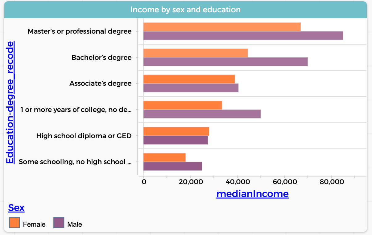
Pretty great, huh? (And maybe a bit depressing.) Let’s look at two more data moves.
One we call calculating (mutating in the tidyverse) is where you make a new variable whose values depend on some existing variable(s). This is like in a spreadsheet where you make a new column with a formula. A simple example would be unit conversion: you get weather data in Celsius but you know you want to think and communicate in Fahrenheit. Calculating is like summarizing, except that when you calculate, you’re creating a new value for every case. When you summarize, you’re aggregating the data, creating a new value for each group (or for the whole dataset).
A more complicated example is recoding data. Suppose you wanted to further collapse the analysis about the effect of education on income and simply compare people who had gone to college with those who had not (rather than asking what degree they got or whether they finished high school). You would create a new column in the table that had only two values; college and no college. That’s recoding, conceptually just like converting Celsius to Fahrenheit; you can find out more about this particular move here.
Finally, let’s look at joining (merging in the tidyverse). The point of a join is to connect two sources of data. For example: suppose we have an idea that in Texas, with lots of pickup trucks, people will have more vehicles than in other states. So we find a dataset—a table—with the number of car registrations in each state.
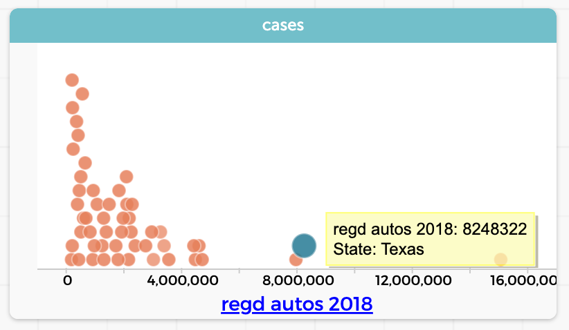
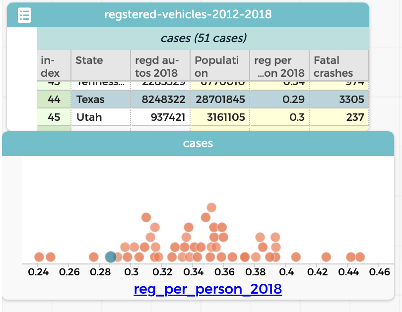
Sure enough, Texas (selected in the graph) has a lot. But we realize that Texas also has a large population, so really we should find out how many cars there are per person in each State. We want to do a calculation with a formula that will be something like (registrations / population). The trouble is, population is not a column in our table. So we get a second table with the state populations. To make the formula work, we need both the registrations and the population in the same table. That’s what requires a “join.”
Again, the precise process depends on your software. The result is a single table with both columns; you then make a new column and perform the calculation data move. The result? Texas actually has the fourth-smallest number of cars per person!
Pretty cool. Five data moves: filtering, grouping, summarizing, calculating, and joining. I hope you see by now that these skills are for more than just data preparation; they are an essential part of your data-science toolbox. Most of us have never explicitly taught these skills; perhaps we’re under the impression that students will just sort of learn them as they go along—as we focus on the “real” curriculum.
But I think we can make them part of what we teach. Data moves are accessible over a wide range of grade levels and can help prepare our students for more open-ended and complex data science investigations. I organized an introduction to data science for high-school juniors and seniors around data moves, and it felt good. Data moves lent needed structure to the investigations and to how I ended up assessing the student work.
Another reason to include data moves in high school is this: we are preparing our students to be citizens in a world where, for better and for worse, we are all both beneficiaries and victims of data science. Data moves are an essential part of what data scientists do, so understanding them helps students evaluate arguments and decisions based on data. Many students have trouble with concepts like filtering, and the actions and formulas that make filtering happen. But if we include filtering in our instruction, and our students actually do it themselves, they will be more critical about what data appear in a media report. And a bonus: while knowing data moves will make our students better equipped to be critical consumers, it also makes them ready to learn more data science if it lights their fire.
Of course, this post is just a quick taste of data moves. You can probably see how learning these moves can foster both independence and inquiry. For more detail and more ideas, read the original paper or this paper by our colleagues in the ESTEEM project that expands upon the original. If you want more detailed descriptions, bits of high-school curriculum and assessment, and live online opportunities to try all of this in CODAP, see my e-book, Awash in Data. Finally, of course, look to the data science learning progressions! B.1.3 and B.1.4 are dripping with data moves, but you will find connections throughout the site.